
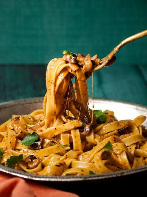
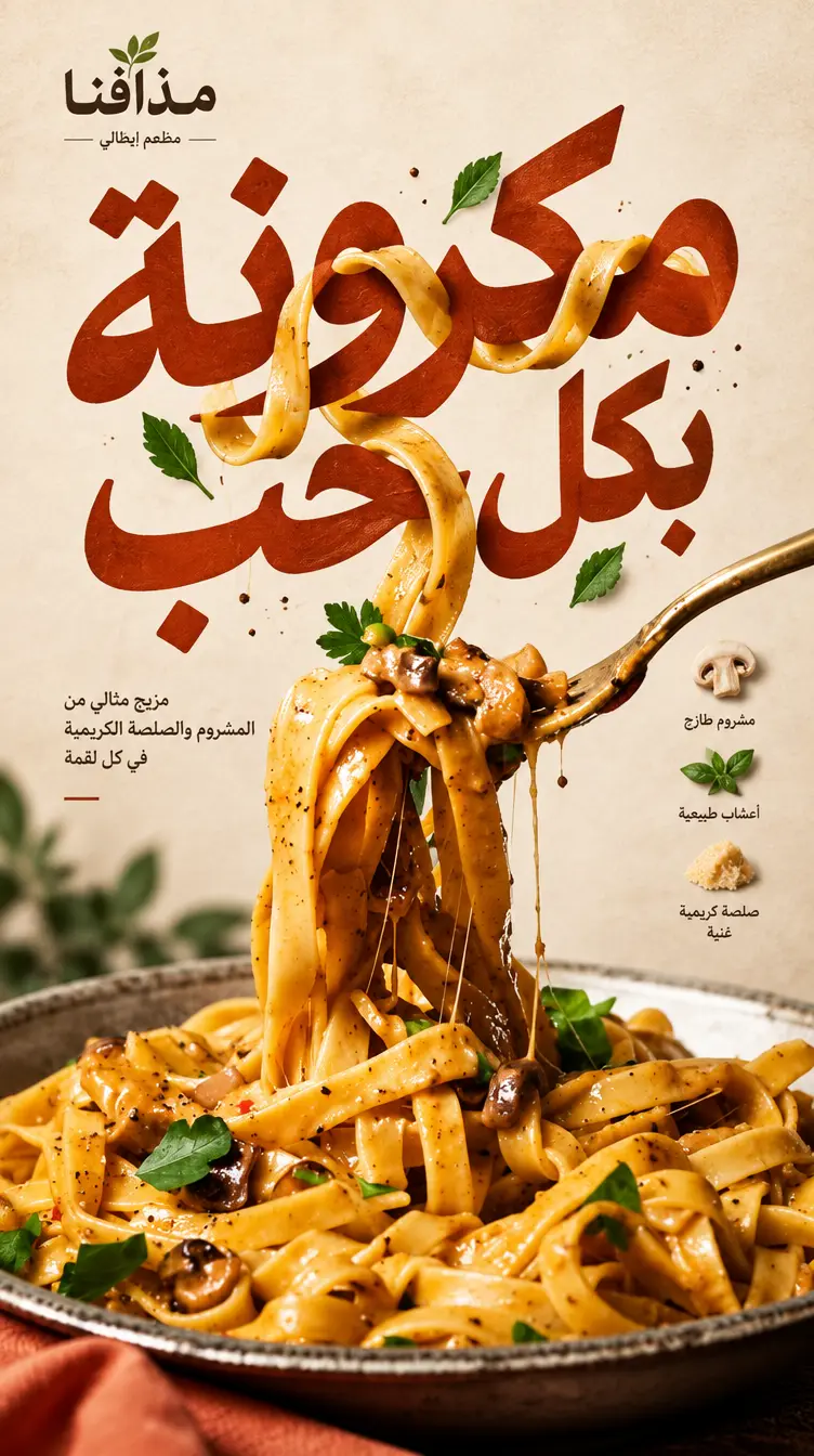
[BRAND]: [اسم البراند] [FOOD / DRINK]: [المنتج الرئيسي] [HEADLINE]: [الكلمة أو العنوان الرئيسي بالعربية] [INTERACTION]: [طريقة تفاعل الطعام مع الكتابة] [ACCENT COLOR]: [اللون الأساسي] [DETAILS]: [التفاصيل] Create a 9:16 vertical food editorial poster combining highly realistic food photography with bold, expressive Arabic typography. **LANGUAGE & TYPOGRAPHY — CRITICAL:** All visible written content in the design must be in **Arabic only**, unless a specific brand name is officially written in Latin characters. Write **[HEADLINE] exactly as provided in Arabic**. Preserve the exact Arabic spelling, letter order, connected letterforms, dots, diacritics if provided, and word structure. Use **correct right-to-left Arabic typography** with naturally connected Arabic letterforms. The Arabic headline must be fully readable, correctly spelled, and visually coherent. Do NOT translate the Arabic headline into English. Do NOT transliterate Arabic into Latin characters. Do NOT generate fake Arabic-looking symbols or pseudo-Arabic text. Do NOT reverse, mirror, disconnect, scramble, replace or randomly reshape Arabic letters. The typography should feel like **professional Arabic editorial art direction** — bold, contemporary, expressive and intentionally composed. Arabic type can be inspired by modern Arabic display typography, geometric Arabic lettering, expressive Arabic poster design or refined contemporary Arabic calligraphy, while remaining highly legible. Use the Arabic headline as one of the strongest visual elements of the composition. --- ### VISUAL DIRECTION Use a warm cream or ivory paper background with subtle natural paper texture. Keep the [FOOD / DRINK] highly realistic, appetizing and materially believable, with natural highlights, shadows, texture, moisture, reflections and accurate proportions. Avoid CGI appearance, plastic surfaces, artificial food textures, floating cutouts, excessive gloss or overly polished 3D commercial rendering. The food must physically interact with the Arabic typography according to **[INTERACTION]**. The relationship between the food and the Arabic letters should feel physically believable, intentional and art-directed — as if the food and typography were designed as one visual object. --- ### TYPOGRAPHY + FOOD INTERACTION For **“weave through type”**: Let a few continuous food elements naturally weave through the Arabic headline, moving clearly **in front of and behind individual Arabic letters**. Maintain believable depth, occlusion, perspective, shadows and contact between the food and typography. The Arabic letters must remain readable even where the food overlaps them. For **“refract type”**: Place transparent glass, liquid, condensation or another realistic optical surface in front of the Arabic headline. Only the Arabic letters visible through the transparent material should be naturally shifted, enlarged, compressed or distorted according to realistic optical refraction. The rest of the typography should remain sharp and stable. For **“create negative space”**: Use the shape, bite, opening, missing section or silhouette of the food to create a deliberate area of negative space where the Arabic headline naturally fits. The typography should feel like it was designed specifically around the physical shape of the food. For **“replace a letter”**: Use the [FOOD / DRINK] or a recognizable part of it as one visual Arabic letter or letterform within **[HEADLINE]**. The complete Arabic word must remain immediately recognizable and readable. The food should function as an intentional typographic element, not simply as an object placed beside the text. When necessary, simplify or stylize the food element slightly to make the Arabic letterform recognizable while keeping the food photorealistic. --- ### COMPOSITION Make **[HEADLINE]** one of the strongest visual elements in the entire poster. Integrate the Arabic typography and food into the same composition rather than treating them as separate elements. Use strong visual hierarchy, intentional negative space, asymmetric editorial composition and sophisticated cropping. Allow parts of the food or typography to extend naturally toward or slightly beyond the frame when appropriate. The composition should work immediately at thumbnail size while revealing detailed textures and subtle visual relationships when viewed up close. Avoid generic centered layouts unless the concept specifically benefits from one. --- ### BRAND DETAILS Add only a few useful brand details such as: [BRAND] ingredients flavor notes opening hours address short Arabic supporting copy Keep all supporting copy **short, purposeful and in Arabic**. Do not fill empty space with meaningless text. Do not add random Arabic words. Do not invent additional brand claims, slogans, prices, addresses or information that were not provided. If [BRAND] is supplied in Latin characters, preserve its exact spelling and logo identity. --- ### COLOR Use **[ACCENT COLOR]** as the primary typographic accent alongside warm cream, ivory, natural food colors and dark neutral tones. Keep the palette controlled, sophisticated and editorial. Avoid excessive colors, gradients or decorative color effects. --- ### NEGATIVE PROMPT / EXCLUSIONS Avoid: English headlines translated headlines Arabic written as Latin characters fake Arabic text pseudo-Arabic symbols incorrect Arabic spelling reversed Arabic text mirrored Arabic text disconnected Arabic letters random letter substitutions missing dots on Arabic letters extra dots garbled typography unreadable text generic filler copy random words numbered labels 01 / 02 Vol. sparkles unnecessary decoration UI-style cards template layouts stock-photo composition floating food cutouts CGI food plastic food textures overly glossy rendering excessive 3D effects artificial shadows unrealistic perspective The final result should feel like a **real, high-end Arabic café, bakery or restaurant editorial campaign** created by an experienced art director and Arabic typographer. The visual idea must be immediately understandable: **the food and the Arabic typography genuinely interact with each other and become one memorable visual concept.**

صور متعلقة
ماذا يقدم بيكاسو الخليج؟

مولّد صور
هل أنت بحاجة إلى خلفية أو شعار لتصميمك؟ بيكاسو الخليج يوفر مولّد الصور بالذكاء الاصطناعي الذي يقوم بإنشاء أي صورة في مخيلتك. قم بكتابة وصف الصورة باللغة التي تريدها، وسيتم إنشاؤها في لحظات. بإمكانك إنشاء أي صورة: خلفية للتصميم، تصميم شعار، تصميم داخلي، صور رجال أو نساء.
أنشئ صورتك الآنمولّد فيديوهات
أنشئ مقاطع فيديو مذهلة باستخدام وصف نصي فقط أو من صورة. مدعوم بأحدث موديلات الفيديو، تحول هذا الأداة أفكارك إلى مرئيات ديناميكية. سواء كنت ترغب في إحياء القصص أو إنشاء مقاطع قصيرة للمحتوى، فإن تقنيتنا تقدم نتائج عالية الجودة في دقائق.
ولّد فيديو الآن
تعديل صور
قم بتعديل صورك بسهولة باستخدام الذكاء الاصطناعي: يمكنك الآن تعديل أجزاء محددة من الصورة، استبدال أو حذف عناصر، إزالة الخلفية، توسيع الصورة، أو تحسين جودتها كل ذلك بوصف نصي أو باستخدام الأدوات. استمتع بحرية إبداعية كاملة ونتائج احترافية في ثواني.
عدّل صورتك الآن
مولد شعارات
مولد الشعارات بالذكاء الاصطناعي لدينا هو أداة متطورة مصممة بعناية لجعل عملية إنشاء الشعارات المذهلة سهلة وفعّالة ، كل ما عليك فعله هو إدخال اسم شركتك وتحديد العناصر التي تتخيلها في الشعار، بما في ذلك الأنماط والألوان المفضلة لديك وأي تفاصيل أخرى تعكس هوية علامتك التجارية. ستقوم الأداة بعد ذلك بإنشاء شعار فريد وعالي الجودة في ثوانٍ معدودة.
ولّد شعارك الآنتحريك شفاه
حوّل مقاطع الفيديو الخاصة بك إلى قصص تنبض بالحياة مع محرّك الشفاه بالذكاء الاصطناعي. كل ما عليك فعله هو اختيار الفيديو، اختيار صوت الشخصية المفضل لديك، وكتابة نص الصوت. في غضون دقائق فقط، سيضيف الذكاء الاصطناعي صوتًا طبيعيًا متزامنًا تمامًا مع الفيديو ليصبح ممتعًا وجاهزًا للمشاركة على أي منصة. سواء كنت تروي قصة، تصنع مقطعًا طريفًا، أو تنشئ محتوى لمتابعيك، هذه الأداة تجعل العملية سهلة وممتعة.
اضف صوت الآن
محرر مشاريع الفيديو
استوديو تحرير فيديو متكامل يعمل مباشرة من المتصفح. اجمع مقاطعك، قصّها ورتّبها، أضف نصوصاً وترجمات، أدرج صوراً وملصقات، وامزج موسيقى> كل ذلك على تايم لاين احترافي متعدد المسارات. اختر من قوالب جاهزة لتبدأ مشروعك بسرعة، حدّد أي نسبة عرض لريلز أو شورتس أو الشاشة العريضة، وصدّر بجودة عالية. بدون تحميل، بدون علامات مائية — فقط اسحب وأفلت وابدأ الإبداع.
ابدأ التحرير الآن
تدريب الذكاء الاصطناعي
درّب نموذج الذكاء الاصطناعي على أشياء لم يتعلمها من قبل. على سبيل المثال: استخدم صورك الشخصية لإنشاء صور لنفسك في أماكن جديدة، أو استخدم صوراً للأماكن المشهورة في مدينتك لإنشاء مشاهد تحتوي على تلك المواقع. لا يوجد حدود لما يمكنك إنشاؤه!.
درّب موديلك الآن
مولّد منشورات تواصل اجتماعي
انشر كالمحترفين على وسائل التواصل! أخبرنا بموضوعك، مثل عبارات تخرج أو بوست عيد ميلاد, وليصمم لك مولدنا للذكاء الاصطناعي تصاميم و نصوص جذابة لتختار منها ما يناسبك. لكل انواع المنشورات: بوستات و ستوريات انستقرام، تغريدات تويتر/بوست تويتر (منصة اكس حاليا), بوست فايس بوك
ولّد منشورك الآن